The documentation currently represents the 4.0.0 release.
For troubleshooting please checkout theFAQ
For troubleshooting please checkout theFAQ
Image
Supported Environment
- Desktop: Yes
- Mobile: Yes
- Screen-reader: No
Getting Started
npm install @draft-js-plugins/editornpm install @draft-js-plugins/imagegettingStarted.js
// It is important to import the Editor which accepts plugins.

import Editor from '@draft-js-plugins/editor';

import createImagePlugin from '@draft-js-plugins/image';
import React from 'react';

const imagePlugin = createImagePlugin();

// The Editor accepts an array of plugins. In this case, only the imagePlugin
// is passed in, although it is possible to pass in multiple plugins.
const MyEditor = ({ editorState, onChange }) => (
  <Editor
    editorState={editorState}
    onChange={onChange}
    plugins={[imagePlugin]}
  />
);

export default MyEditor;
Importing the default styles
The plugin ships with a default styling available at this location in the installed package: node_modules/@draft-js-plugins/image/lib/plugin.css
Webpack Usage
- 1. Install Webpack loaders:
npm i style-loader css-loader --save-dev - 2. Add the below section to Webpack config (if your config already has a loaders array, simply add the below loader object to your existing list.
module.exports = { module: { loaders: [ { test: /plugin\.css$/, loaders: ['style-loader', 'css'], }, ], }, }; - 3. Add the below import line to your component to tell Webpack to inject the style to your component.
import '@draft-js-plugins/image/lib/plugin.css'; - 4. Restart Webpack.
Configuration Parameters
themeObject of CSS classes with the following keys.
image: CSS class for the image.
addImage: CSS class.
addImagePopover: CSS class.
addImageClosedPopover: CSS class.
addImageBottomGradient: CSS class.
addImageButton: CSS class.
addImagePressedButton: CSS class.
addImageInput: CSS class.
addImageConfirmButton: CSS class.
imageComponentPass in a custom image component to be rendered.
addImageButtonContentContent of button which opens add image popup. (Default content is 📷)
Simple Example
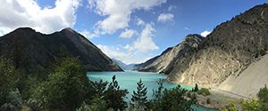
You can have images in your text field. This is a very rudimentary example, but you can enhance the image plugin with resizing, focus or alignment plugins.
See advanced examples further down …
SimpleImageEditor.js
import React, { Component } from 'react';
import { convertFromRaw, EditorState } from 'draft-js';

import Editor from '@draft-js-plugins/editor';

import createImagePlugin from '@draft-js-plugins/image';
import editorStyles from './editorStyles.module.css';

const imagePlugin = createImagePlugin();
const plugins = [imagePlugin];

/* eslint-disable */
const initialState = {
  entityMap: {
    0: {
      type: 'IMAGE',
      mutability: 'IMMUTABLE',
      data: {
        src: '/images/canada-landscape-small.jpg',
      },
    },
  },
  blocks: [
    {
      key: '9gm3s',
      text:
        'You can have images in your text field. This is a very rudimentary example, but you can enhance the image plugin with resizing, focus or alignment plugins.',
      type: 'unstyled',
      depth: 0,
      inlineStyleRanges: [],
      entityRanges: [],
      data: {},
    },
    {
      key: 'ov7r',
      text: ' ',
      type: 'atomic',
      depth: 0,
      inlineStyleRanges: [],
      entityRanges: [
        {
          offset: 0,
          length: 1,
          key: 0,
        },
      ],
      data: {},
    },
    {
      key: 'e23a8',
      text: 'See advanced examples further down …',
      type: 'unstyled',
      depth: 0,
      inlineStyleRanges: [],
      entityRanges: [],
      data: {},
    },
  ],
};
/* eslint-enable */

export default class SimpleImageEditor extends Component {
  state = {
    editorState: EditorState.createWithContent(convertFromRaw(initialState)),
  };

  onChange = (editorState) => {
    this.setState({
      editorState,
    });
  };

  focus = () => {
    this.editor.focus();
  };

  render() {
    return (
      <div>
        <div className={editorStyles.editor} onClick={this.focus}>
          <Editor
            editorState={this.state.editorState}
            onChange={this.onChange}
            plugins={plugins}
            ref={(element) => {
              this.editor = element;
            }}
          />
        </div>
      </div>
    );
  }
}
editorStyles.css
.editor {
  box-sizing: border-box;
  border: 1px solid #ddd;
  cursor: text;
  padding: 16px;
  border-radius: 2px;
  margin-bottom: 2em;
  box-shadow: inset 0px 1px 8px -3px #ABABAB;
  background: #fefefe;
}

.editor :global(.public-DraftEditor-content) {
  min-height: 140px;
}

.options {
  margin-bottom: 20px;
}
Alignment + Resize + Focus + Drag'n'Drop + Drag'n'Drop Upload Example
You can have images in your text field. This is a very rudimentary example, but you can enhance the image plugin with resizing, focus or alignment plugins.
See advanced examples further down …
mockUpload.js
import { readFile } from '@draft-js-plugins/drag-n-drop-upload';

/*
*
* @name: mockUpload
* @desc: Custom file upload function. Simulates a file upload.
* @param {[File], formData} data: consists of an array of files that have been uploaded and a formData object composed of those same files.
* @param {function([{name: string, src: string}])} success - function to mark a successfull file upload, it takes an array of successfully uploaded files.
* @param {function({name: string, src?: string})} failed - function that is called to mark a failure to upload one or more files. Removes the upload placeholders.
* @param {(function(percent:int, file: {name:string, src:string})} progress - function to mark the progress in percentage points. It updates the progress count on each placeholder.
*/
export default function mockUpload(data, success, failed, progress) {
  function doProgress(percent) {
    progress(percent || 1);
    if (percent === 100) {
      // Start reading the file
      Promise.all(data.files.map(readFile)).then((files) =>
        success(files, { retainSrc: true })
      );
    } else {
      setTimeout(doProgress, 250, (percent || 0) + 10);
    }
  }

  doProgress();
}
AddImageEditor.js
import React, { Component } from 'react';
import { convertFromRaw, EditorState } from 'draft-js';

import Editor, { composeDecorators } from '@draft-js-plugins/editor';

import createImagePlugin from '@draft-js-plugins/image';

import createAlignmentPlugin from '@draft-js-plugins/alignment';

import createFocusPlugin from '@draft-js-plugins/focus';

import createResizeablePlugin from '@draft-js-plugins/resizeable';

import createBlockDndPlugin from '@draft-js-plugins/drag-n-drop';

import createDragNDropUploadPlugin from '@draft-js-plugins/drag-n-drop-upload';
import editorStyles from './editorStyles.module.css';
import mockUpload from './mockUpload';

const focusPlugin = createFocusPlugin();
const resizeablePlugin = createResizeablePlugin();
const blockDndPlugin = createBlockDndPlugin();
const alignmentPlugin = createAlignmentPlugin();
const { AlignmentTool } = alignmentPlugin;

const decorator = composeDecorators(
  resizeablePlugin.decorator,
  alignmentPlugin.decorator,
  focusPlugin.decorator,
  blockDndPlugin.decorator
);
const imagePlugin = createImagePlugin({ decorator });

const dragNDropFileUploadPlugin = createDragNDropUploadPlugin({
  handleUpload: mockUpload,
  addImage: imagePlugin.addImage,
});

const plugins = [
  dragNDropFileUploadPlugin,
  blockDndPlugin,
  focusPlugin,
  alignmentPlugin,
  resizeablePlugin,
  imagePlugin,
];

/* eslint-disable */
const initialState = {
  entityMap: {
    0: {
      type: 'IMAGE',
      mutability: 'IMMUTABLE',
      data: {
        src: '/images/canada-landscape-small.jpg',
      },
    },
  },
  blocks: [
    {
      key: '9gm3s',
      text:
        'You can have images in your text field. This is a very rudimentary example, but you can enhance the image plugin with resizing, focus or alignment plugins.',
      type: 'unstyled',
      depth: 0,
      inlineStyleRanges: [],
      entityRanges: [],
      data: {},
    },
    {
      key: 'ov7r',
      text: ' ',
      type: 'atomic',
      depth: 0,
      inlineStyleRanges: [],
      entityRanges: [
        {
          offset: 0,
          length: 1,
          key: 0,
        },
      ],
      data: {},
    },
    {
      key: 'e23a8',
      text: 'See advanced examples further down …',
      type: 'unstyled',
      depth: 0,
      inlineStyleRanges: [],
      entityRanges: [],
      data: {},
    },
  ],
};
/* eslint-enable */

export default class CustomImageEditor extends Component {
  state = {
    editorState: EditorState.createWithContent(convertFromRaw(initialState)),
  };

  onChange = (editorState) => {
    this.setState({
      editorState,
    });
  };

  focus = () => {
    this.editor.focus();
  };

  render() {
    return (
      <div>
        <div className={editorStyles.editor} onClick={this.focus}>
          <Editor
            editorState={this.state.editorState}
            onChange={this.onChange}
            plugins={plugins}
            ref={(element) => {
              this.editor = element;
            }}
          />
          <AlignmentTool />
        </div>
      </div>
    );
  }
}
editorStyles.css
.editor {
  box-sizing: border-box;
  border: 1px solid #ddd;
  cursor: text;
  padding: 16px;
  border-radius: 2px;
  margin-bottom: 2em;
  box-shadow: inset 0px 1px 8px -3px #ABABAB;
  background: #fefefe;
}

.editor :global(.public-DraftEditor-content) {
  min-height: 140px;
}

.options {
  margin-bottom: 20px;
}
Add Image Button Example
Click on the + button below and insert "/images/canada-landscape-small.jpg" to add the landscape image. Alternativly you can use any image url on the web.
AddImageEditor.js
import React, { Component } from 'react';

import Editor, { createEditorStateWithText } from '@draft-js-plugins/editor';

import createImagePlugin from '@draft-js-plugins/image';
import ImageAdd from './ImageAdd';

import editorStyles from './editorStyles.module.css';

const imagePlugin = createImagePlugin();
const plugins = [imagePlugin];

const text =
  'Click on the + button below and insert "/images/canada-landscape-small.jpg" to add the landscape image. Alternativly you can use any image url on the web.';

export default class CustomImageEditor extends Component {
  state = {
    editorState: createEditorStateWithText(text),
  };

  onChange = (editorState) => {
    this.setState({
      editorState,
    });
  };

  focus = () => {
    this.editor.focus();
  };

  render() {
    return (
      <div>
        <div className={editorStyles.editor} onClick={this.focus}>
          <Editor
            editorState={this.state.editorState}
            onChange={this.onChange}
            plugins={plugins}
            ref={(element) => {
              this.editor = element;
            }}
          />
        </div>
        <ImageAdd
          editorState={this.state.editorState}
          onChange={this.onChange}
          modifier={imagePlugin.addImage}
        />
      </div>
    );
  }
}
editorStyles.css
.editor {
  box-sizing: border-box;
  border: 1px solid #ddd;
  cursor: text;
  padding: 16px;
  border-radius: 2px;
  margin-bottom: 2em;
  box-shadow: inset 0px 1px 8px -3px #ABABAB;
  background: #fefefe;
}

.editor :global(.public-DraftEditor-content) {
  min-height: 140px;
}

.options {
  margin-bottom: 20px;
}